George’s recent post about data visualization makes me realize I need to get around to sharing some of the work we’re doing here. My main research group at BYU is spending most of its time these days on educational data mining and applying / developing visualization techniques (including “dashboards”). We’ve taken to calling the coupling of openness with real data the “peanut butter cup” model, because openness and data really are two great tastes that taste great together. More on peanut butter cups in an upcoming post.
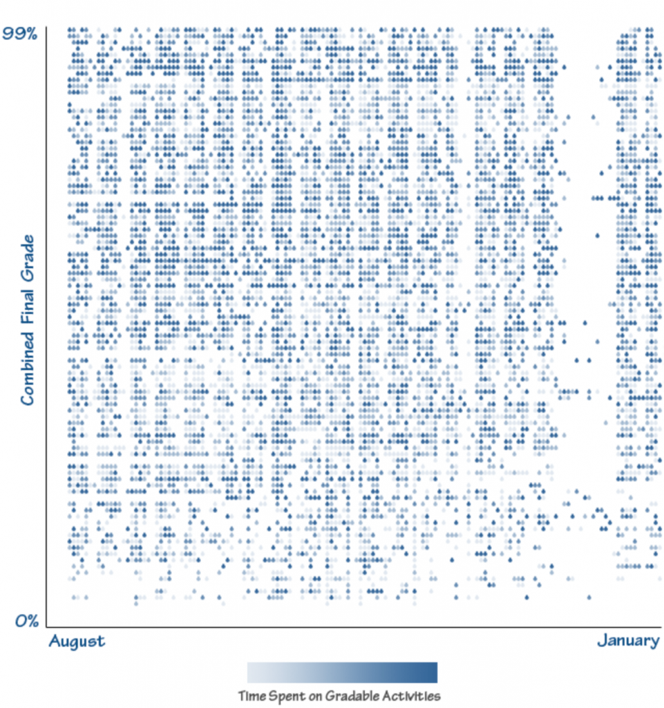
The first visualization we’ve developed is one we call the “Waterfall.” The vertical axis represents students’ final grades (higher final grades at the top). The horizontal axis represents time, with each cell representing a day in the semester. Each individual row represents an individual student. Finally, the darkness of the water droplet represents the amount of time that student spent that day completing gradable activities:
We call this visualization the Waterfall because the drops have all but evaporated away by the time you reach the bottom of the image (meaning that students with lower final grades spend much less time on their work), reinforcing what we know about the relationship between time-on-task and academic performance. It’s also interesting to be able to see Christmas break, Thanksgiving, weekends, etc., as empty white columns in the data – almost as if holidays were rocks at the top of the waterfall.
Kudos to Aaron Johnson, Seth Gurell, Marissa Nielson, and Mary McEwen who are the students participating in this work.

Hi David,
I like your visualisation. Can I ask? How did you measure the ‘amount of time that student spent that day completing gradable activities’? Also, it appears that students might be expected to undertake ‘gradable activities’ almost every day. Is that usual at BYU or am I misreading the chart?
Thanks
Mark
This is incredibly nifty. What software did you use to generate the visualization? Is the source code available somewhere (and is it open source)?
Mark, let me give a few clarifications. The data visualization is for a high school, not BYU. The amount of time spent on gradeable activities is measured by the BrainHoney learning management system. It does not include time they might have spent away from the LMS or offline.
Yes, you are reading the chart correctly. Most students were engaged in at least some kind of gradeable activity each day (excluding holidays). They may not be submitting, but they are checking rubrics, grading sheets, etc.